top of page


OVERVIEW
How do you answer the inevitable question -
"What can I make for dinner tonight?"
KitchenOS puts a world of culinary expertise and creativity in your pocket. Using the latest in food science, cooking techniques, and artificial intelligence, KitchenOS helps you create inspiring and delicious dishes with what you have at home.
ROLE:
UX Designer, Researcher
METHODS:
Comparative & Competitive Analysis, Usability Testing, Affinity Mapping, User Persona, Journey Mapping, User Flows, Accessibility Analysis, Site Mapping, Sketching, Wireframing, Prototyping & Iteration

.png)
USER INTERVIEWS
"Lack of ingredients is a challenge while cooking"
Do you ever google recipes and the results give you a list of 50 ingredients you don’t have? I conducted 5 interviews with people who call themselves “enthusiastic cooks,” and their main complaint with finding recipes was never having all of the ingredients at once. This leads to more trips to the grocery store and more importantly — more time wasted.
PERSONA
.png)
COMPETITIVE ANALYSIS

COMPARATIVE ANALYSIS

ESTABLISHING THE PROBLEM
Users need innovative meal prep guidence specifically for their kitchen so that she can be efficient and creative when cooking a meal, because coming up with a new meal is time consuming and stressfull.
How Might We
Guide users to prepare an innovative meal out of normal ingredients?
.png)
DEVELOPE
Sketches
The team conducted a design studio with KitchenOS's founder to produce and brainstorm our frames. The quick sketches were our most efficient ways to explain the logic of our big picture ideas, and help cut out any early design flaws. This helped build communication within our team. Here are some of the main screens we put on paper.
User Flows & Wireframing
.png)


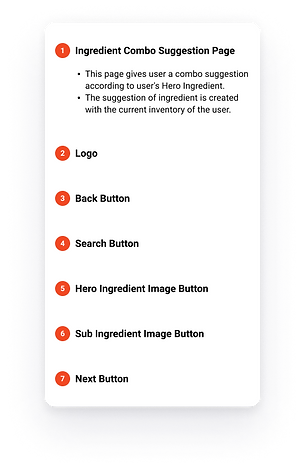
Hero Ingredient
To help our user be quick with their decision, I chose this concept so the user could enter only 1 ingredient and then the app would make suggestions from there.
We turned our sketches into wireframes using Figma
.png)

.png)

.png)


.png)
.png)

.png)


DESIGN SYSTEM
For a product launch, we also had the task of choosing a design system. I selected lively colors associated with kitchen and homeware to appeal to the target user. The blue Call to Action button will be inviting. To give the app a modern look, I selected the typeface of Koho for all text on the app, while the font size was determined by industry standards.

Usabilty Testing
-Users gave an average of 8/10 for usability.
As a result of utilizing the data gathered from tests, it becomes easier to identify usability problems and make improvements.
-Onboarding took and average time of 1 min, 10 sec
-Users gave positive feedback on the substitution and replace features.
.png)
.png)
.png)
.png)
100%
NEXT STEPS
Add a Shopping feature
Giving the users a chance to shop for groceries within the app would be beneficial in that users will stay on KitchenOS, and it will give the app more opportunities to adapt to the customers diet.
Make a Scanning feature
Due to time constraints in our sprint, we were unable to test our a scanning feature. I thought this would be a n efficient solution for inputting items in an individuals pantry, especially when they first use it.


Prototype
bottom of page